Platform unification
for Epsilon Latam
Merging two disconnected platforms into a single cohesive product — reducing onboarding complexity for 250+ publishers across Latin America. I was the UX/UI designer and design system specialist, co-leading the unification effort alongside a second UX designer — working directly with a PM, a design lead, and the development team throughout the two-year engagement.
Responsibilities
- Led design system unification
- UX research & usability testing
- Information architecture redesign
- UI design & component library
- Success metrics definition
- Direct collaboration with devs
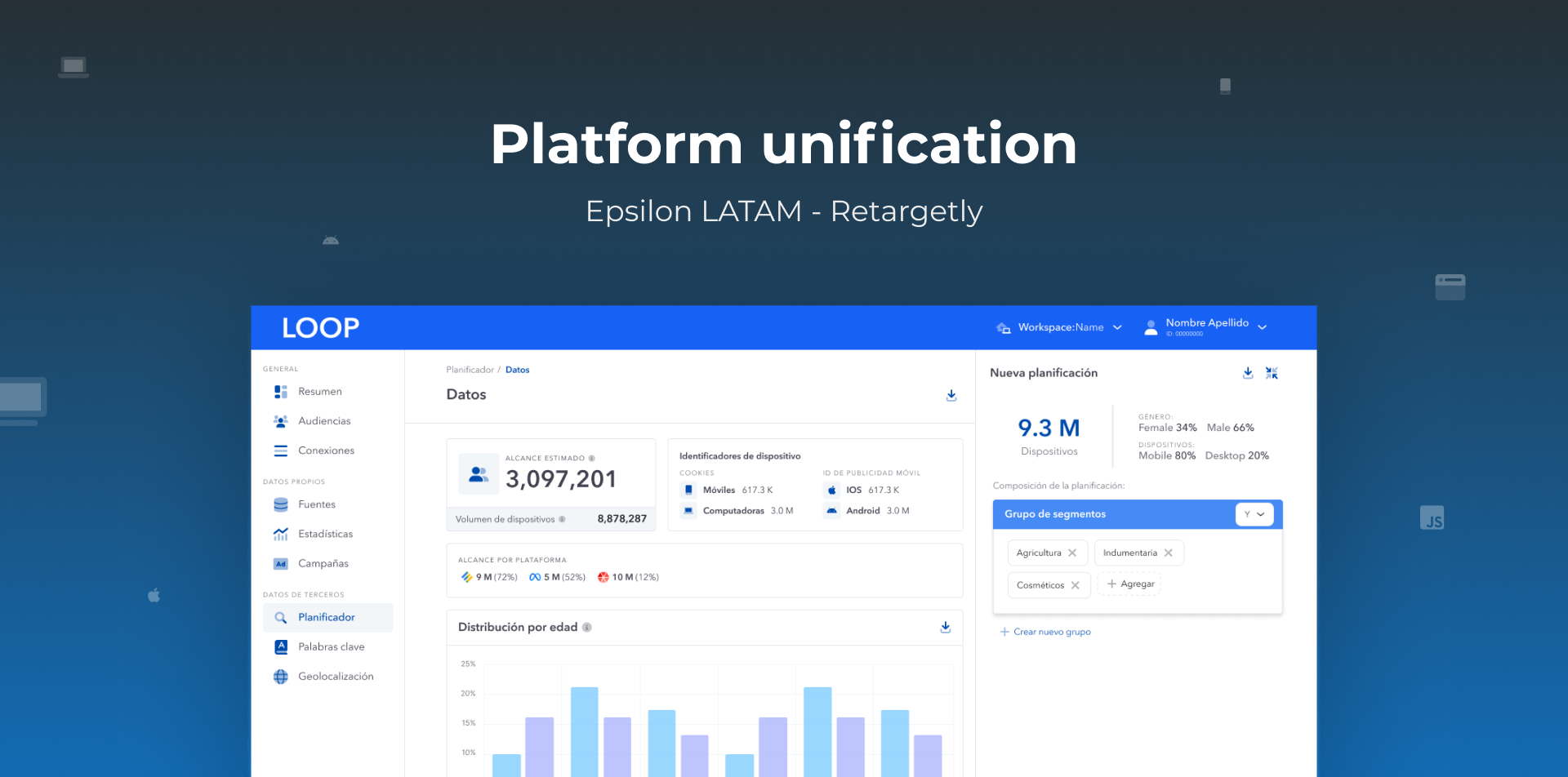
One product. Two platforms.
Zero coherence.
Retargetly is a data platform that helps 250+ publisher clients across Latin America leverage first-party and third-party data to build audiences, reach the right customers, and monetize their media assets.
The core problem: completing a single end-to-end workflow required operating across two structurally and visually disconnected platforms. Publishers would create and manage audience segments in one environment — then switch to a completely separate platform, with a different login, different navigation, and different visual language — to publish, monitor performance, and replicate campaigns across digital channels.
"Both platforms belonged to the same product — but users would never know it."
The publisher role had high turnover across the region. New users constantly had to learn two separate systems before they could complete their first task, and many required formal training just to get started.
Two platforms became one
The original product lived across two environments with completely different visual identities, navigation patterns, and authentication flows. The unified platform — Loop — brought everything under a single coherent system.
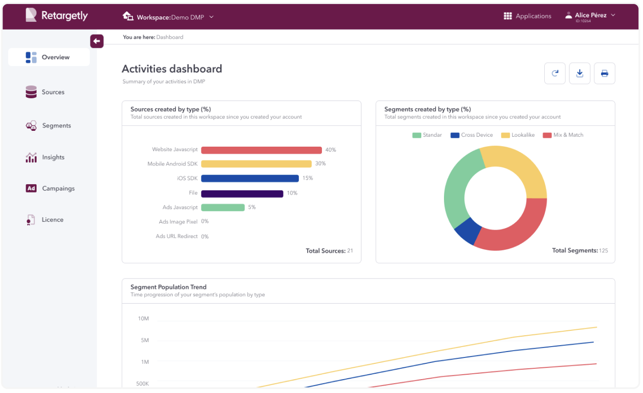
Audience creation platform. Dark theme, separate login, own navigation structure.
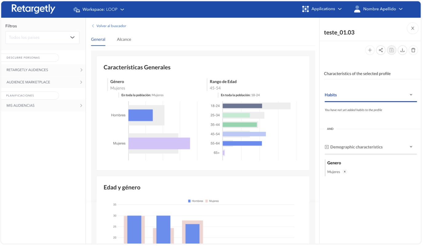
Monetization & analytics platform. Different visual language, required a second login to access.
What was actually breaking for users
Through multiple rounds of user interviews, usability testing, A/B tests, and workshops — sessions of 4–5 publishers each — we uncovered the real friction beneath the surface-level visual inconsistency.
Double authentication
Users had to log in separately to each platform for every session — even while working on the same continuous task.
No campaign overview
There was no single view of all campaigns. Users couldn't see everything they'd created in one place, leading to duplicated work and errors.
High learning curve
New publishers — a frequently rotating role — needed formal training. Experienced users often had to onboard colleagues personally.
Visual inconsistency
Two button styles, two navigation patterns, two color systems — in a product meant to be one. Constant cognitive friction mid-workflow.
"Publishers didn't understand which platform owned which step of their workflow — it wasn't just a visual problem, it was an architecture problem."
How we approached the unification
This wasn't a rebrand. It was a structural redesign of how users moved through the product — with a new visual system built to support it.
Research across both platforms
We ran multiple rounds of user interviews, usability tests, A/B tests, and workshops with publisher teams — sessions of 4–5 participants each. The insight that reframed everything: publishers didn't understand which platform owned which step of their workflow. The problem wasn't just visual — it was architectural.
Interviews · Usability testing · A/B testing · WorkshopsDefining success metrics with the product team
During discovery, I worked with the PM to define what success would look like before designing anything — including reduced drop-off in key flows and improved task completion time. After release, we tracked these through Mixpanel, while staying attentive to qualitative signals like support tickets and follow-up interviews, which often surface what numbers miss.
Mixpanel · Task completion rate · Qualitative feedbackRedesigning the information architecture
We restructured the platform tree so every action had a clear, logical home. The most significant change: adding a unified campaign overview that had never existed before — giving users full visibility across their work in one place. The header and sidebar were preserved as anchors of familiarity to reduce transition friction.
Building the Loop design system
I led the creation of the unified design system — a new visual identity expressing the product's tech character while maintaining structural consistency. We unified typography, charts, button styles, color tokens, and component patterns across both platforms into a single scalable library.
DS lead · Components · Tokens · Grid systemGradual, friction-aware rollout
Rather than launching everything at once, we introduced changes progressively — letting users adapt without the shock of a full overhaul overnight. We monitored adoption and error rates at each stage, continuing to resolve visual inconsistencies as the rollout progressed.
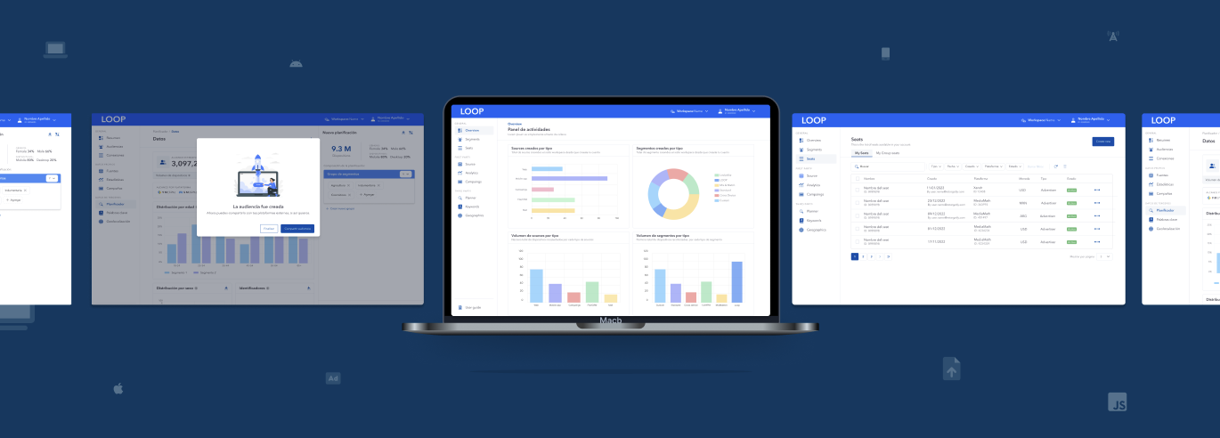
Component library — forms, notifications, modals, data tables and more, unified across the platform.
What changed after launch
Faster segment creation
Time to complete and share a segment dropped 20% after unified flows launched — tracked via task completion pre and post-release.
Single sign-on
Double authentication eliminated entirely. Publishers log in once and access the full platform without interruption.
Positive reception across 250+ publishers
The gradual rollout strategy paid off — all publisher clients adopted Loop without significant pushback. Follow-up interviews showed users found the platform more intuitive from day one. Visual inconsistencies inherited from the legacy systems were progressively resolved throughout the rollout.
What I took from this project
Unifying two legacy platforms over two years taught me that the hardest design problems aren't visual — they're structural. The real work was making clear that what looked like cosmetic inconsistency was actually an architecture problem costing users time and confidence every day.
The gradual rollout was the right call. It taught me that change management is part of the design process — shipping something users can actually adapt to is more valuable than shipping something perfect that disrupts them.
I'd invest more time upfront mapping the exact decision points where users got lost between platforms before jumping into visual solutions. That would have sharpened the IA work earlier in the process.